Views: 0 Author: Site Editor Publish Time: 2026-07-27 Origin: Site
Receiving a reorder batch of custom apparel where your brand’s signature color is visibly off by two shades is a costly reality. When premium inventory becomes unusable under strict brand guidelines, it creates an immediate supply chain crisis. Color deviation directly erodes consumer trust and weakens brand identity. A premium label quickly feels amateurish when customers notice inconsistent hues across different production runs.
While digital design relies on exact hex codes, physical apparel manufacturing involves volatile variables. Fabric chemistry, dye lot variations, and ink curing temperatures make repeatable color accuracy a highly technical challenge. Establishing a rigorous, verifiable color management protocol with manufacturing partners is essential. You need a system to ensure precise, repeatable Pantone matching across every production run.
Pantone is a Target, Not a Guarantee: The Pantone Matching System (PMS) provides a universal language, but final output is dictated by fabric composition and ink chemistry.
Fabric Dictates Absorption: Heavyweight hoodies and specific cotton/poly blends require distinct dye formulations; changing blanks between orders destroys color consistency.
Verification Requires Data, Not Just Eyes: Professional consistency relies on spectrophotometer readings (Delta E tolerances) and standardized lighting (D65), not subjective visual checks.
Master Samples are Non-Negotiable: Retaining physical, approved "golden samples" from the initial run is the only reliable baseline for evaluating future reorders.
Digital Translation is a Process: Relying on uncalibrated digital monitors or converting directly from CMYK to PMS without specialized color profiles guarantees physical-to-digital mismatch.
Defining an acceptable match in apparel manufacturing requires moving away from digital screen comparisons to physical textile realities. The goal is mathematical proximity to a target, measured under controlled conditions. You cannot hold a smartphone screen up to a fleece garment and expect a 100% match. Light emits from a screen, while fabric absorbs and reflects ambient light. This fundamental difference in physics dictates how we must approach color standards in production.
The Pantone Matching System separates standards by substrate. Pantone Coated (C) and Uncoated (U) are designed for ink on paper. Pantone Textile (TCX/TPG) standards are formulated specifically for cotton and synthetic fibers. Providing a standard graphic design Pantone (C) to an apparel manufacturer often leads to translation errors on fabric because ink sits differently on paper than dye absorbs into yarn.
When a designer selects a PMS Coated color, they are looking at ink printed on glossy paper. If you send that same code to a dye house, the technicians must formulate a chemical dye bath to mimic that glossy paper look on porous cotton. This translation is where most errors occur. Using the correct TCX code from the start eliminates this guesswork.
| Pantone System | Intended Substrate | Manufacturing Application |
|---|---|---|
| Pantone Coated (C) | Glossy Paper | Hangtags, Packaging, Poly Mailers |
| Pantone Uncoated (U) | Matte Paper | Cardboard boxes, Matte inserts |
| Pantone Textile (TCX) | Cotton / Textiles | Fabric dyeing, Woven labels |
| Pantone Plastics (PQ) | Plastic compounds | Zippers, Aglets, Buttons |
Emissive light from digital screens uses RGB, creating color through illumination. Subtractive ink uses CMYK, absorbing light to display color. Spot-color matching relies on pre-mixed Pantone formulas. Converting brand guidelines from CMYK or digital HEX straight to physical fabric without color management software calibration guarantees a mismatch. Screens display vibrant neons that physical dyes simply cannot replicate on cotton.
Many brands make the mistake of approving colors based on a PDF mockup viewed on an uncalibrated laptop monitor. The factory then prints the garment using physical pigments. When the physical product arrives, it looks duller than the screen. This is not a factory error; it is a failure to understand the limitations of the CMYK color gamut compared to the RGB color space.
Fabric composition dictates dye chemistry. A 100% cotton garment absorbs reactive dyes, yielding deep, saturated colors. Polyester requires disperse dyes, which bond differently under heat. Color matching on Custom Hoodies introduces further complexity. Fabric density and fleece backing alter how ink sits on the garment surface, often requiring modified ink viscosity.
If you switch your blank garment from a 100% cotton face to a 50/50 cotton-poly blend for a reorder, the exact same ink formula will look different. The polyester fibers will not absorb water-based inks the same way cotton does, leading to a heathered or faded appearance. Consistency requires locking in the fabric blend just as strictly as the Pantone code.
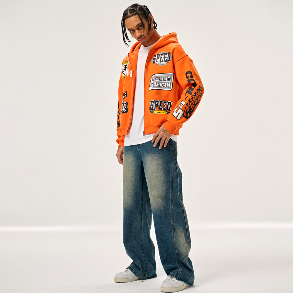
Specific manufacturing stages introduce risks where color drift occurs between the first order and subsequent reorders. Understanding these variables allows you to build better technical packs and hold your factory accountable.
In commercial dyeing, no two vats of dye are chemically identical. Temperature, humidity, and water quality at the dye house on the day of production affect the final hue. A slight shift in water pH can alter how the fabric absorbs the dye, causing a visible shift in the final garment color.
Factories mix dyes in massive industrial vats. Even with computerized dispensing systems, the ambient humidity in the factory can affect the moisture content of the raw cotton before it enters the vat. This alters the absorption rate. Brands must accept a minor degree of dye lot variation, which is why establishing mathematical tolerances is better than demanding absolute perfection.
Color stability varies across ink types. Plastisol sits on top of the fabric, offering high opacity and color accuracy. Water-based and discharge inks penetrate the fibers, resulting in a softer hand feel but higher susceptibility to color shift. High-heat curing processes can cause pigments to shift or darken. Manufacturers must compensate for this thermal shift during the initial mixing phase.
Mixing: Technicians weigh pigments to the gram based on a Pantone formula guide.
Printing: The ink is pushed through a mesh screen onto the fabric.
Flashing: A quick burst of heat gels the ink so subsequent colors can be printed on top.
Curing: The garment runs through a conveyor dryer at 320°F to 330°F to set the ink permanently.
During that final curing stage, the heat can cause the fabric dyes to sublimate and migrate into the printed ink. A bright yellow print on a red garment might turn slightly orange after exiting the dryer if not properly managed.
Printing the exact same Pantone ink formula on a black garment versus a white garment yields entirely different results without proper preparation. Dark fabrics require a white underbase. If the underbase is too thin, the dark fabric absorbs light, dulling the top color. If dye migration occurs, the fabric dye bleeds into the printed ink, altering the Pantone match.
When ordering Private Label Hoodies, you must specify the underbase requirements in your tech pack. A premium print shop will use a blocker base on polyester-rich garments to prevent dye migration, ensuring the top colors remain vibrant and true to the Pantone standard.
Achieving visual cohesion across different mediums requires managing cross-material touchpoints carefully. Your brand color must look identical on the garment, the neck label, the hangtag, and the shipping mailer.
A Pantone shade looks different on custom apparel fabric compared to printed cardboard poly mailers, woven neck labels, and paper hangtags. The texture and light reflectivity of each material alter human perception of the color. To manage this, brands must use specific Pantone libraries for each substrate, matching a PMS Coated tag with a TCX fabric dye to achieve visual harmony.
Woven labels present a unique challenge. They are created using pre-dyed polyester threads. You cannot mix threads like you mix ink. The factory must select the closest available thread color from their supplier's catalog. You must review physical thread swatches against your fabric lab dips to ensure they align visually under standard lighting.
Brands must demand mandatory quality control checkpoints from their manufacturing partners to ensure consistency. You cannot manage what you do not measure.
Lab dips are small fabric swatches custom-dyed to match a specific Pantone standard. Strike-offs are physical proofs of screen-printed graphics. Reviewing these physical proofs before authorizing full production is a critical step. Do not rely on digital photographs of lab dips, as camera sensors and monitor calibration will distort the color.
When reviewing a lab dip, you should receive at least three options: one slightly lighter, one on target, and one slightly darker. This allows you to choose the best visual match for your specific fabric texture.
Metamerism occurs when a color looks correct under factory fluorescent lights but wrong in natural daylight. Mandating the use of standardized light boxes for all color approvals eliminates this variable. D65 daylight and TL84 store lighting are standard settings used to evaluate lab dips and strike-offs accurately.
If you approve a color while sitting in an office with warm incandescent bulbs, it will look completely different when your customer wears it outside in the sun. Always evaluate physical samples under a D65 light source to replicate natural daylight.
Delta E is the mathematical measurement of visual difference between two colors. Establishing realistic commercial tolerances is necessary for premium Heavyweight Hoodies reorders. A Delta E of less than 2.0 is generally considered a commercially acceptable match, meaning the difference is barely perceptible to the human eye.
| Delta E (ΔE) Value | Visual Perception | Commercial Acceptability |
|---|---|---|
| < 1.0 | Imperceptible difference | Excellent / Master Sample Quality |
| 1.0 - 2.0 | Barely perceptible to trained eyes | Standard Commercial Tolerance |
| 2.0 - 3.0 | Perceptible at close range | Borderline / Requires Concession |
| > 3.0 | Obvious color difference | Rejected / Unacceptable |
Vetting vendors based on their technical color management capabilities ensures long-term consistency. You need to ask the right questions before wiring a deposit.
Spectrophotometers in the ink-mixing room are necessary to verify Pantone formulas before printing begins. Prospective manufacturers should use device calibration profiles to align digital mockups with physical press outputs. This hardware removes human subjectivity from the ink mixing process.
Ask your factory for a video tour of their ink mixing station. If you see technicians mixing ink by eye with a spatula and a bucket, run away. You want to see digital scales, computerized formula software, and spectrophotometers.
The "Golden Sample" protocol requires both the brand and the factory to store approved physical samples. These master samples must be kept in dark, climate-controlled environments to prevent UV fading and fabric degradation. They serve as the definitive baseline for evaluating all future production runs.
Never use the last item in your warehouse as the standard for the next reorder. That item has likely been exposed to light, dust, and humidity. Always pull the sealed master sample from your archives to compare against the new factory strike-offs.
Evaluate how the factory logs production data. They must record ink formulas, mesh counts, squeegee pressure, and curing times from the initial run to replicate them exactly. Without documented SOPs, the factory is merely guessing during the reorder process.
A professional factory will have a job ticket attached to your specific design file. This ticket contains all the technical variables used during the first successful run. When you place a reorder six months later, they pull that exact ticket and replicate the machine settings.
Balancing absolute color perfection, production speed, and unit costs requires strategic decision-making. You must decide where your brand sits on the spectrum of cost versus consistency.
Custom garment dyeing offers high consistency but requires high minimum order quantities and longer lead times. Printing on pre-made blanks offers lower minimums but carries a higher risk of base-color variation, especially in heavyweight fleece. Brands must weigh the financial implications of each approach against their tolerance for color drift.
If you buy pre-made blanks from a wholesale distributor, you are at the mercy of their dye lots. You might receive shirts from three different manufacturing batches in a single order. Custom dyeing your own fabric guarantees a single, uniform dye lot, but requires significant upfront capital.
Ordering larger initial runs guarantees a single dye lot, ensuring perfect consistency across the entire batch. However, this carries the inventory risk of warehousing unsold stock. On-demand printing reduces inventory risk but increases the likelihood of dye lot variations across different fulfillment batches.
If color consistency is the absolute highest priority for your brand identity, you must order in bulk and hold inventory. The physics of commercial dyeing simply do not support perfect consistency across small, staggered on-demand orders printed months apart.
Achieving 100% perfect color matching across years of reorders is a scientific impossibility due to textile degradation and dye lot shifts. However, strict tolerances of ΔE less than 2.0 are highly achievable with the right partner. Immediately disqualify manufacturers who promise perfect Pantone matches without mentioning lab dips, spectrophotometers, or fabric chemistry.
Audit your current tech packs to ensure you are specifying Pantone TCX codes for fabric and Coated codes for packaging.
Request a documented color management SOP from your prospective manufacturing partners before placing your next order.
Establish a physical "Golden Sample" archive in a dark, climate-controlled environment for all approved production runs.
Mandate that your factory provides spectrophotometer readings (Delta E) alongside physical strike-offs for all reorders.
A: An exact match means mathematically within an imperceptible range, measured by Delta E. Commercial tolerance allows for a Delta E under 2.0. Due to fabric texture and dye chemistry, a 100% perfect visual match to a paper swatch is impossible, but strict tolerances ensure the difference is virtually invisible.
A: Reorder variations stem from commercial dye lot shifts, changes in ambient factory humidity, or undocumented ink mixing formulas. Even slight changes in the fabric blend ratio between production runs will alter how the fabric absorbs dye and ink.
A: Pantone spot colors are mandatory for brand consistency in screen printing. RGB is strictly for digital screens and cannot be printed. CMYK is reserved for complex, multi-color digital prints but is highly variable and lacks the precision of pre-mixed Pantone inks.
A: Use separate Pantone standards for different materials. Specify Pantone TCX for fabric dyes and Pantone Coated (C) or Uncoated (U) for paper packaging. This ensures visual harmony across substrates that absorb light differently.
A: A lab dip is the process of dyeing small fabric swatches to match a specific Pantone standard. These swatches are reviewed under standardized lighting before bulk fabric production is authorized, ensuring the dye formula is correct.
A: Ink opacity varies. Dark garments require a white underbase to prevent the fabric color from dulling the printed ink. Additionally, fabric dyes can migrate under high curing heat, tinting the printed Pantone color if not properly managed.


