Views: 0 Author: Site Editor Publish Time: 2026-08-06 Origin: Site
Designing two-piece apparel presents a unique mechanical and aesthetic challenge for clothing developers. A poorly planned logo placement can turn a premium matching set into disjointed, amateur-looking merchandise. Brands often finalize top-half designs in isolation, leading to severe visual imbalance when paired with bottoms. This oversight results in diluted brand identity, lower perceived retail value, and wasted production budgets for Custom Hoodie Sets.
To avoid these manufacturing pitfalls, apparel developers must adopt a systematic approach to evaluating branding placements. A unified strategy ensures visual cohesion across both garments. It accommodates physical production constraints on the factory floor and maximizes the return on custom apparel investments. By treating the top and bottom as a single continuous canvas, you create a seamless aesthetic that resonates with consumers. We will break down the exact placement coordinates, production limitations, and design frameworks needed to execute a flawless production run.
Visual Anchoring: Consistent looks require a primary focal point (usually the hoodie) and a secondary, complementary anchor (the sweatpants) to avoid overwhelming the wearer.
Contextual Visibility: Center chest and upper back placements ensure brand visibility even when the hoodie is layered under open jackets, blazers, or overcoats.
Cost vs. Impact: Adding multiple unique placements (e.g., outside neck labels, sleeve prints) increases perceived value, turning a basic fleece run into a premium streetwear tracksuit.
Production Realities: Seams, zippers, and kangaroo pockets dictate viable print areas; designs must be adapted to these physical constraints before finalizing tech packs.
Visual balance dictates how the human eye scans a garment from top to bottom. Applying the "Rule of Thirds" in apparel design prevents top-heavy or bottom-heavy branding. Imagine a grid overlaying the entire wearer. If all heavy graphics sit in the top third, the outfit feels disproportionate and visually unstable. You must map the visual journey from the hoodie neckline down to the sweatpant hem using precise measurements.
A successful design guides the viewer naturally. If the top features a bold, oversized graphic spanning 12 inches across the chest, the lower half requires breathing room. Conversely, heavy leg prints demand a more restrained upper design. This distribution of visual weight ensures the garments look intentional when worn together. We use specific grid mapping techniques during the tech pack phase to lock in these proportions.
Measure the total vertical length of the combined garments on a standard medium fit model.
Divide the total length into three equal horizontal zones.
Assign the primary brand graphic to one zone, ensuring it occupies no more than 40% of the available surface area.
Place the secondary anchor graphic in a contrasting zone, scaled down by at least 30% relative to the primary graphic.
Verify that the middle zone remains relatively clear to act as a visual break between the top and bottom pieces.
Inconsistent typography ruins the cohesion of any apparel collection. You must establish strict guidelines for standardizing fonts, sizes, and weights across both pieces. A bold sans-serif font on the chest clashes violently with a delicate script on the leg. Maintain the exact same font family, kerning rules, and line spacing across the entire set. When setting up screens for printing, even a one-millimeter difference in stroke width becomes glaringly obvious.
Translating a horizontal chest slogan into a vertical leg print requires careful adjustment. You cannot simply rotate the text 90 degrees and expect it to look correct. Adjust the tracking to ensure readability when the text runs down the outer seam. The visual weight of the vertical text must match the horizontal text to maintain a unified aesthetic. We recommend using a minimum font size of 24 points for vertical leg prints to ensure legibility from a distance of ten feet.
Placement choices must reflect the core identity of the brand. Corporate uniform sets demand minimalist requirements. They rely on subtle, traditional placements that convey professionalism without distraction. In contrast, a Streetwear Tracksuit thrives on high-impact, oversized placements that challenge conventional design norms. The placement strategy dictates the entire manufacturing approach, from platen selection to ink viscosity.
Building a branded apparel style guide standardizes these decisions. Document exact logo dimensions, placement coordinates, and acceptable colorways. This guide ensures consistency across all future production runs. When a new manufacturer takes over, the style guide prevents unexpected variations in logo positioning. Include specific measurements from fixed seams, such as "three inches down from the collar seam and four inches left of the center placket."
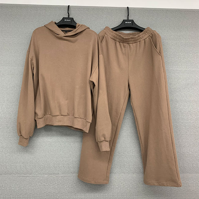
The left chest placement remains the industry standard for a reason. It offers low-risk, high familiarity for corporate branding. It sits naturally over the heart, making it instantly recognizable. The standard measurement is typically 3.5 to 4 inches wide, positioned 7 to 9 inches down from the left shoulder seam. The right chest placement serves a different strategic purpose. It is ideal for co-branding, secondary partner logos, or specialized dual-embellishments when the left chest is already occupied.
Center chest placements offer distinct advantages for layering. A center graphic remains visible under unzipped jackets or formal blazers. It supports bold, high-impact typography perfectly. The upper back placement provides high visibility in crowded environments. It serves as a prime location for displaying large brand assets, intricate graphics, or primary slogans that make a strong impression from behind. When printing on the upper back, ensure the graphic sits at least 4 inches below the collar seam to avoid distortion from the hood resting against the fabric.
Secondary placements elevate the garment from basic to premium. The outside label at the back neckline mimics premium retail brands. It replaces itchy interior tags and elevates the professional look of the garment. This subtle detail signals high manufacturing standards to the consumer. We often use a high-density silicone print or a woven damask label for this specific area to ensure durability against constant friction.
Sleeve and forearm placements capture the rising trend of vertical text. Repeating logos down the arm create a distinct aesthetic. Hood edge and drawstring placements offer another layer of detail. While these micro-placements present technical difficulties during printing or embroidery, they deliver exceptionally high perceived value. Printing on the hood edge requires a specialized curved platen and a highly skilled press operator to maintain registration across multiple color passes.
Outside Back Neckline: 2 inches wide, positioned 1 inch below the collar seam.
Outer Sleeve: 12 to 14 inches long, starting 3 inches below the shoulder seam.
Forearm: 6 inches long, positioned 2 inches above the ribbed cuff.
Hood Edge: 0.5 inches tall, running parallel to the outer hood seam.
Drawstring Aglets: Custom molded plastic or engraved metal tips.
The mirror framework relies on symmetrical alignment to create order. Pairing a left chest top logo with a left thigh bottom logo establishes a clean, predictable visual line. The eye naturally tracks down the left side of the body. This configuration remains the safest, most universally accepted approach for athletic and corporate sets. It requires minimal setup adjustments on the production floor.
Symmetry communicates stability. When designing a Hoodie and Sweatpants Set for team wear, this framework ensures uniform appearance across different body types. It minimizes design risks and guarantees a professional finish. The left thigh print should typically sit 4 to 6 inches below the pocket line and measure no more than 4 inches in width to maintain balance with the chest logo.
Asymmetrical balance drives a modern, fashion-forward aesthetic. The offset framework pairs a center chest graphic with a lower calf or back-pocket print on the bottoms. This diagonal visual journey creates dynamic tension. It breaks the monotony of traditional uniform design and forces the viewer to engage with the entire outfit.
Retail brands utilize this framework to stand out on the racks. By placing graphics in unexpected locations, the garments feel custom and highly curated. The offset approach requires a strong understanding of negative space to prevent the outfit from looking chaotic. A heavy center chest graphic paired with a subtle, tonal print on the right calf achieves this balance perfectly.
| Framework Type | Top Placement | Bottom Placement | Best Used For | Visual Effect |
|---|---|---|---|---|
| Mirror (Symmetrical) | Left Chest | Left Thigh | Corporate, Team Uniforms | Clean, predictable, highly professional. |
| Offset (Asymmetrical) | Center Chest | Lower Calf / Back Pocket | Retail, Streetwear | Dynamic, fashion-forward, custom feel. |
| Dual Anchor | Upper Back | Right Thigh | Athleisure, Lifestyle Brands | Balanced weight distribution from front to back. |
| Micro Detail | Hood Edge | Ankle Cuff | Premium Boutique | Subtle, high-end, discovery-based branding. |
Proportion dictates the success of matching sets. You cannot use the exact same logo file for both garments without adjusting the scale. Guidelines dictate sizing down the sweatpants graphic by 30-50% relative to the primary top graphic. This maintains a clear visual hierarchy. If you use a 10-inch wide graphic on the chest, the corresponding leg graphic should not exceed 5 to 7 inches in width.
If the leg graphic competes in size with the chest graphic, the set feels overwhelming. The top should serve as the primary anchor, with the bottoms acting as the complementary secondary anchor. Proper scaling ensures the garments complement rather than compete with each other. Always test these proportions by printing paper templates and pinning them to blank garments before burning any screens.
Production methods heavily influence placement viability. Print-on-Demand (POD) systems often restrict printing near seams, pockets, and waistbands due to platen limitations. Direct-to-garment (DTG) machines require perfectly flat surfaces to prevent print head strikes. If the print head hits a thick seam, it ruins the garment and potentially damages the machine. Bulk screen printing offers more flexibility for complex, over-the-seam designs because the screens can flex slightly over uneven surfaces.
Scalability becomes an issue when moving from POD to bulk manufacturing. A complex sleeve print executed easily on a specialized POD setup might require expensive custom pallets for bulk screen printing. You must evaluate these limitations before finalizing the tech pack to ensure seamless scaling. Always consult with your production manager about maximum print areas and platen availability before promising edge-to-edge designs to a client.
DTG requires 100% cotton face yarn for optimal ink adhesion.
Screen printing requires specific mesh counts (e.g., 110 for thick white ink, 230 for fine details).
Water-based inks provide a softer hand feel but require longer curing times in the conveyor dryer.
Plastisol inks sit on top of the fabric and are better suited for heavy fleece blends.
Garment structure dictates print boundaries. Printing across split-zip garments introduces severe alignment risks. Fabric shifting during the curing process causes the two halves of the graphic to misalign. Pullovers eliminate this risk, providing a continuous canvas for center chest designs. If you must print over a zipper, use a specialized zipper platen and accept a higher defect rate during quality control.
Kangaroo pockets require strict clearance margins. Printing too close to the pocket seam causes ink pooling or embroidery distortion. We mandate a minimum clearance of 1.5 inches from any pocket seam. Ribbed cuffs and waistbands present another obstacle. These areas stretch significantly during wear. They require specialized stretch additives in the ink or woven tags rather than standard direct-to-garment prints to prevent severe cracking after the first wash cycle.
Every additional placement impacts the base production cost. Adding a thigh print to complete the set requires separate screen setups, extra hooping time for embroidery, and additional labor for garment handling. You must conduct a margin analysis to determine if the final product supports these additions. Calculate the setup fees, run charges, and potential defect rates for each new print location.
Calculate whether the increased retail appeal justifies the multi-placement production cost. A basic set with a single chest logo yields a standard margin. Adding a complementary leg print elevates the set to a premium tier, often allowing for a retail markup that far exceeds the raw production increase. The key is finding the sweet spot where the perceived value outpaces the manufacturing expenses.
Strategically utilizing four distinct placements dramatically elevates perceived value. Combining a left chest logo, an outer sleeve hit, a custom hood edge detail, and a matching thigh print transforms basic blanks into premium collector products. This playbook maximizes the visual impact of the garments. It requires meticulous coordination between the design team and the print shop to ensure all elements align perfectly.
Consumers perceive multi-placement garments as higher quality. The intricate detailing suggests careful craftsmanship and brand authority. This strategy turns standard fleece runs into highly desirable merchandise that commands premium market positioning. Ensure that the ink colors match perfectly across all placements by using standardized Pantone matching systems (PMS) during ink mixing.
When budgets tighten, consolidation strategies maintain brand impact without excessive printing costs. Woven hem tags offer a sophisticated, cost-effective alternative to large secondary prints. Sewing a branded tag onto the bottom hem of the top and the pocket line of the bottoms unifies the set instantly. These tags can be ordered in bulk and applied quickly with a single straight stitch.
Custom aglets on drawstrings provide another subtle branding opportunity. These physical details consolidate the brand identity across both pieces. They deliver a premium feel without the setup times associated with additional screen printing or embroidery runs. Replacing standard flat drawstrings with custom-dyed round cords featuring branded metal tips instantly upgrades the entire set.
Standardize your typography, font weights, and logo dimensions across both garments to establish a unified visual language.
Select the "Mirror" framework for corporate or athletic uniforms to guarantee a clean, professional appearance on the production floor.
Adopt the "Offset" framework for retail collections to create dynamic, fashion-forward tension that stands out on the rack.
Request physical production samples to verify seam clearances and test ink behavior near zippers, pockets, and ribbed cuffs.
Finalize your tech packs with exact placement coordinates, Pantone colors, and scale percentages to prevent errors during bulk manufacturing.
A: The left chest and left thigh combination works best. This "Mirror" framework provides professional, non-intrusive visibility that aligns perfectly with corporate branding standards and requires minimal setup adjustments during bulk production.
A: Standard dimensions typically range from 8 to 10 inches wide. The exact size depends on the grading of the garment to ensure it fits properly across different sizes without falling into the armpit seams.
A: Use the left chest for standard corporate or individual brand presence. Reserve the right chest for co-branding, dual logos, or to balance out a contrasting left-side graphic when executing complex multi-placement designs.
A: Printing over zippers carries high alignment risks and can cause ink buildup. It is better to use offset placements or specialized screen printing techniques with custom zipper platens designed for uneven surfaces.
A: The center chest and outside back neckline are optimal. These placements ensure the brand remains visible even when the garment is layered under open outerwear, maintaining brand presence in all environments.
A: Yes. Additional placements require extra setup times for new screens, custom ink mixing, or repositioning for DTG hooping, which impacts both the overall turnaround time and the final production costs.


